The hardware and bandwidth for this mirror is donated by METANET, the Webhosting and Full Service-Cloud Provider.
If you wish to report a bug, or if you are interested in having us mirror your free-software or open-source project, please feel free to contact us at mirror[@]metanet.ch.

The goal of cusumcharter is to create both simple CUSUM charts, with and without control limits from a vector, or to create multiple CUSUM charts, with or without control limits, from a grouped dataframe, tibble or data.table.
CUSUM charts detect small changes over time, and will alert quicker than a Statistical Process Control chart. They are an excellent alternative to run and control charts, particularly where data is scarce, infrequent, or expensive to obtain.
They monitor the difference between each data point, relative to a target value, which is often the mean of all the currently available data points. Using these variances and targets, control limits are calculated. Any points outside these limits are an indication that the process is out of control.
Install the development version from GitHub with:
# install.packages("remotes")
remotes::install_github("johnmackintosh/cusumcharter")This returns the CUSUM statistics for a single vector, centred on a supplied target value:
library(cusumcharter)
test_vec <- c(0.175, 0.152, 0.15, 0.207, 0.136, 0.212, 0.166)

cusum_res <- cusum_single(test_vec, target = 0.16)
cusum_res
#> [1] 0.175 0.167 0.157 0.204 0.180 0.232 0.238This function takes a single vector as input and returns a data.frame with additional information used to calculate the CUSUM statistic
test_vec2 <- c(0.175, 0.152, 0.15, 0.207, 0.136, 0.212, 0.166)
cusum_single_df(test_vec2, target = 0.16)
#>       x target     si cusumx cusum_target
#> 1 0.175   0.16  0.015  0.015        0.175
#> 2 0.152   0.16 -0.008  0.007        0.167
#> 3 0.150   0.16 -0.010 -0.003        0.157
#> 4 0.207   0.16  0.047  0.044        0.204
#> 5 0.136   0.16 -0.024  0.020        0.180
#> 6 0.212   0.16  0.052  0.072        0.232
#> 7 0.166   0.16  0.006  0.078        0.238
Here we don’t supply a target, so the mean is used
test_vec3 <- c(1,1,2,11,3,5,7,2,4,3,5)
cusum_single_df(test_vec3)
#>     x target si cusumx cusum_target
#> 1   1      4 -3     -3            1
#> 2   1      4 -3     -6           -2
#> 3   2      4 -2     -8           -4
#> 4  11      4  7     -1            3
#> 5   3      4 -1     -2            2
#> 6   5      4  1     -1            3
#> 7   7      4  3      2            6
#> 8   2      4 -2      0            4
#> 9   4      4  0      0            4
#> 10  3      4 -1     -1            3
#> 11 5 4 1 0 4Two additional functions allow you to calculate control limits from a single vector and plot a CUSUM chart with control limits. As before, the mean is used to determine the target if none is provided. Alternate functions are available if you wish to use the median instead.
test_vec3 <- c(1,1,2,3,5,7,11,7,5,7,8,9,5)
controls <- cusum_control(test_vec3, target = 4)
controls
#>     x target variance std_dev cusum      cplus      cneg cum_nplus cum_nneg
#> 1   1      4       -3 1.77305    -3  0.0000000 -2.113475         0        1
#> 2   1      4       -3 1.77305    -6  0.0000000 -4.226950         0        2
#> 3   2      4       -2 1.77305    -8  0.0000000 -5.340426         0        3
#> 4   3      4       -1 1.77305    -9  0.0000000 -5.453901         0        4
#> 5   5      4        1 1.77305    -8  0.1134752 -3.567376         1        5
#> 6   7      4        3 1.77305    -5  2.2269504  0.000000         2        0
#> 7  11      4        7 1.77305     2  8.3404255  0.000000         3        0
#> 8   7      4        3 1.77305     5 10.4539007  0.000000         4        0
#> 9   5      4        1 1.77305     6 10.5673759  0.000000         5        0
#> 10  7      4        3 1.77305     9 12.6808511  0.000000         6        0
#> 11  8      4        4 1.77305    13 15.7943262  0.000000         7        0
#> 12  9      4        5 1.77305    18 19.9078014  0.000000         8        0
#> 13  5      4        1 1.77305    19 20.0212766  0.000000         9        0
#>         ucl       lcl centre obs
#> 1  7.092199 -7.092199      0   1
#> 2  7.092199 -7.092199      0   2
#> 3  7.092199 -7.092199      0   3
#> 4  7.092199 -7.092199      0   4
#> 5  7.092199 -7.092199      0   5
#> 6  7.092199 -7.092199      0   6
#> 7  7.092199 -7.092199      0   7
#> 8  7.092199 -7.092199      0   8
#> 9  7.092199 -7.092199      0   9
#> 10 7.092199 -7.092199      0  10
#> 11 7.092199 -7.092199      0  11
#> 12 7.092199 -7.092199      0  12
#> 13 7.092199 -7.092199      0  13
Also see the cusum_control_median function
test_vec3 <- c(1,1,2,3,5,7,11,7,5,7,8,9,5)
controls <- cusum_control(test_vec3, target = 4)

cusum_control_plot(controls,
                   xvar = obs,
                   title_text = "CUSUM out of control since 7th observation")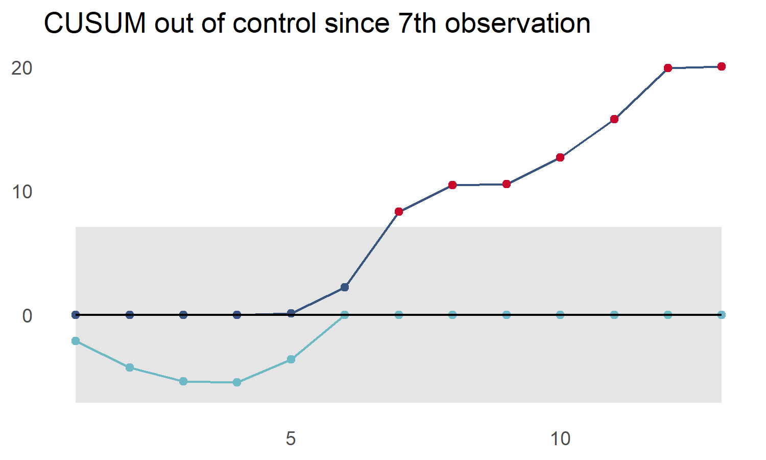
library(dplyr)
#>
#> Attaching package: 'dplyr'
#> The following objects are masked from 'package:stats':
#>
#>     filter, lag
#> The following objects are masked from 'package:base':
#>
#>     intersect, setdiff, setequal, union
library(tibble)
library(ggplot2)
library(cusumcharter)

testdata <- tibble::tibble(
  N = c(1L,2L,1L,3L,1L,1L,1L,1L,1L,
        1L,3L,2L,3L,2L,7L,11L,7L,9L),
  metric = c("metric1","metric1","metric1","metric1","metric1",
           "metric1","metric1","metric1","metric1","metric2",
           "metric2","metric2","metric2","metric2","metric2",
           "metric2","metric2","metric2"))

testres <- testdata %>%
  dplyr::group_by(metric) %>%
  dplyr::mutate(cusum_control(N)) %>%
  dplyr::ungroup()
#> no target value supplied, so using the mean of x
#> no target value supplied, so using the mean of x

p <- cusum_control_plot(testres,
                        xvar = obs,
                        facet_var = metric,
                        title_text = "Faceted CUSUM Control plots")
p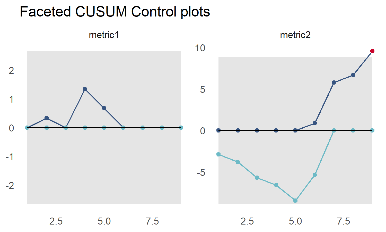
Here we add a date column, specify that the scale_type
is 'date', and provide the datebreaks argument
to plot our data over time
library(dplyr)
library(ggplot2)
library(cusumcharter)

testdata <- tibble::tibble(
 N = c(1L,2L,1L,3L,1L,1L,1L,1L,1L,
        1L,3L,2L,3L,2L,7L,11L,7L,9L),
  metric = c("metric1","metric1","metric1","metric1","metric1",
           "metric1","metric1","metric1","metric1","metric2",
           "metric2","metric2","metric2","metric2","metric2",
           "metric2","metric2","metric2"))

datecol <- as.Date(c("2021-01-01","2021-01-02", "2021-01-03", "2021-01-04" ,
             "2021-01-05", "2021-01-06","2021-01-07", "2021-01-08",
             "2021-01-09"))

testres <- testdata %>%
  dplyr::group_by(metric) %>%
  dplyr::mutate(cusum_control(N)) %>%
  dplyr::ungroup() %>%
  dplyr::group_by(metric) %>%
  dplyr::mutate(report_date = datecol) %>%
  ungroup()
#> no target value supplied, so using the mean of x
#> no target value supplied, so using the mean of x

p2 <- cusum_control_plot(testres,
                         xvar = report_date,
                         facet_var = metric,
                         title_text = "Faceted plots with date axis",
                         scale_type = "date",
                         datebreaks = '4 days')

p2 <- p2 + ggplot2::theme(axis.text.x = ggplot2::element_text(angle = 90,
                                                              hjust = 1,
                                                              vjust = 0.5))
p2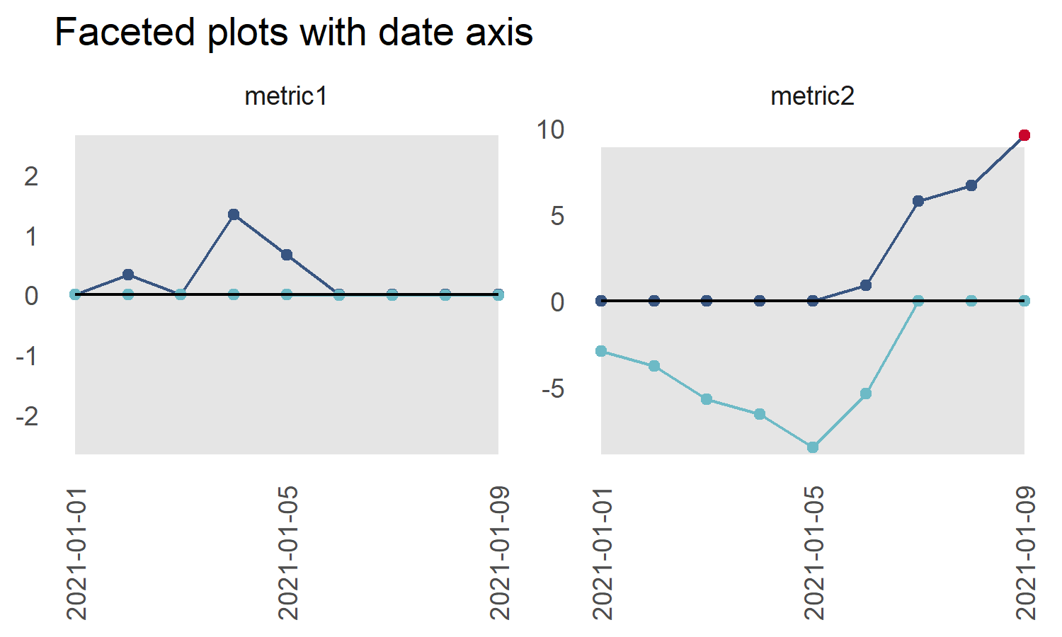
Points outside the Upper Control Limit are always highlighted. Use
the show_below option to enable highlighting points below
the Lower Control Limit
library(dplyr)
library(ggplot2)
library(cusumcharter)

testdata <- tibble::tibble(
N = c(-15L,2L,-11L,3L,1L,1L,-11L,1L,1L,
2L,1L,1L,1L,10L,7L,9L,11L,9L),
metric = c("metric1","metric1","metric1","metric1","metric1",
"metric1","metric1","metric1","metric1","metric2",
"metric2","metric2","metric2","metric2","metric2",
"metric2","metric2","metric2"))

datecol <- as.Date(c("2021-01-01","2021-01-02", "2021-01-03", "2021-01-04" ,
             "2021-01-05", "2021-01-06","2021-01-07", "2021-01-08",
             "2021-01-09"))

testres <- testdata %>%
  dplyr::group_by(metric) %>%
  dplyr::mutate(cusum_control(N)) %>%
  dplyr::ungroup() %>%
  dplyr::group_by(metric) %>%
  dplyr::mutate(report_date = datecol) %>%
  ungroup()
#> no target value supplied, so using the mean of x
#> no target value supplied, so using the mean of x


p5 <- cusum_control_plot(testres,
                         xvar = report_date,
                         show_below = TRUE,
                         facet_var = metric,
                         title_text = "Highlights above and below control limits")
p5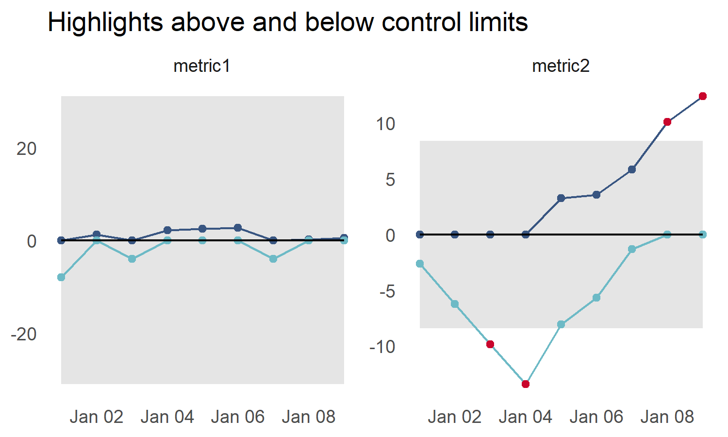
These binaries (installable software) and packages are in development.
They may not be fully stable and should be used with caution. We make no claims about them.