The hardware and bandwidth for this mirror is donated by METANET, the Webhosting and Full Service-Cloud Provider.
If you wish to report a bug, or if you are interested in having us mirror your free-software or open-source project, please feel free to contact us at mirror[@]metanet.ch.
![]()
regress3d is an R package for plotting regression surfaces and marginal effects in three dimensions. The plots created by regress3d are plotly objects. They can be customized using functions and arguments from the plotly package.
The core two functions of regress3d are
add_3d_surface(): create a three dimensional surface
for a regression with two explanatory \(x\) variables , andadd_marginals(): create a three dimensional visual for
the marginal effects of a regression with two explanatory \(x\) variables.The vignettes walk you through examples of regression surfaces for three types of models.
A handy feature for binomial glms and other regressions that use
discrete data is the function add_jitter(). This function
mimics ggplot2::geom_jitter() in ggplot2,
helping users visualize overlaid points in a three dimensional graphic.
It is demonstrated in the generalized
linear models vignette.
We recommend you start with the vignette on linear models, which will introduce you to working with the interactive images, interpreting the regression surface, and understanding how the marginal effects are depicted. ## Installation
Install regress3d from GitHub:
if (!require("devtools")) {
  install.packages("devtools")
}

devtools::install_github("ellaFosterMolina/regress3d")regress3d allows the user to plot regression surfaces and marginal effects in three dimensions. Linear models, generalized linear models, and either of those model types with interaction terms are currently supported.
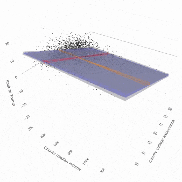
A multiple linear regression surface and marginal effects are shown below using the core two functions in regress3d:
add_3d_surface(), andadd_marginals().Start by calling the two required libraries: regress3d and plotly.
library(regress3d)
library(plotly)The variables in this example are county level measures from 2016.
r_shift: the shift towards Donald Trump in 2016, as
measured as the difference between the county’s vote for Trump in 2016
and the county’s vote for the Republican presidential nominee, Mitt
Romney, in 2012,median_income16: median income, andany_college: the percent of the county that was
enrolled in college at some point, regardless of whether they
graduated.The regression is weighted by pop_estimate16, the number
of people in a county, to capture the influence of large counties.
The model can be specified within add_3d_surface() and
add_marginals(), but for clarity we specify it before we
create the graphic. Here we use a multiple linear regression with two
\(x\) variables.
mymodel <- lm(r_shift ~ median_income16 + any_college,
data = county_data, weight = pop_estimate16)Next, we create a plotly::plot_ly() object using the
same variables as in the model. We then layer on the scattercloud, 3D
surface, marginals, and labels.
Note that while regression notation often uses \(x_1\) and \(x_2\) to represent the explanatory variables and \(y\) for the outcome, the plotly command will use \(x\) and \(y\) for the explanatory variables and \(z\) for the outcome variable.
plot_ly( data = county_data,
         x = ~median_income16,
         y = ~any_college,
         z = ~r_shift) %>%
  add_markers(size = ~pop_estimate16, color = I("black"))  %>%
  add_3d_surface(model = mymodel) %>%
  add_marginals(model = mymodel) %>%
  layout(
    scene = list(xaxis = list(title = 'County median income'),
                 yaxis = list(title = 'County college experience'),
                 zaxis = list(title = 'Shift to Trump'))
  )
The code above renders to an html figure. It displays the outputs of:
add_3d_surface(): a regression surface in translucent
blue with 95% confidence intervals in translucent grey;add_marginals(): the marginal effects and 95%
confidence intervals of each \(x\)
variable with red and orange lines;plotly::add_markers(): a plotly function to create a
scattercloud of each county used to generate the regression
surface;plotly::layout(): a plotly function to adjust the
graphic’s labels.Since the landing page for a package does not support interactive html figures, a gif is displayed below. See https://ellafostermolina.github.io/regress3d/articles/linear_models_3d.html#improvements-with-plotly for an interactive version of this image.
This graphic corresponds to the following numerical regression results.
| % shift to Trump, 2012-2016 | |
| County median income ($1,000s) | -0.013 |
| (0.007) | |
| County college experience | -0.344* |
| (0.012) | |
| Constant | 20.103* |
| (0.512) | |
| Observations | 3,111 |
| Adjusted R2 | 0.371 |
| Note: | * p<0.05 |
These binaries (installable software) and packages are in development.
They may not be fully stable and should be used with caution. We make no claims about them.